

Rich_Winsor
-
Posts
1092 -
Joined
Content Type
Profiles
Forums
Gallery
Posts posted by Rich_Winsor
-
-
Nice joke. Thanks for the humor.
Thanks Doug. Speaking of bike riding, now that
you have warmed up with a cross country jaunt
are you ready to tackle the highest peaks in
Europe?
-
OK, so who did it? Come on, fess up......
OK (sheepishly raising hand), I'll cop to it.
With the overall tenor of the forum lately and
all the sniveling about Chief's perceived lack
of CAD tools I thought it would be fun to see
what people's reactions would be. I wish I
had thought of the SSA angle while I was
trying to flesh out my phony article with some
plausible sounding techno-babble. Could of
had some real fun there. I was originally going
to create an imaginary publication called
"AutoCAD Weakly"
 but it was running
late so I just borrowed a page from the
CADALYST web site and edited it in PSP to
suit my purposes.
Hope y'all got a chuckle out of it.
-
Hi Laura, while I am no ray trace maven this topic
has been bandied about on the forums quite a bit.
If you use the search feature in the upper right hand
corner it will lead you to quite a few threads. Be sure
to change "this topic" to "forums". I entered " ray trace
settings" and got numerous results. This is one of
the better ones:
https://chieftalk.chiefarchitect.com/index.php?/topic/2803-raytrace-questions/?hl=+ray +trace +settings
-
Wow! This is the first that I have heard of this.

-
 1
1
-
-
What's new on this update?
We have prepared an interim update to correct two important issues in X7. The update notes for 17.1.2.2 are attached.
Attached Files -
So.... what you are saying is that everything is "peachy".
Sorry, couldn't resist that one.

-
That is probably an option in prefs you have not set.
Don't know D. Scott. Preferences says that it
should be checking for updates daily.
What has been holding me back from updating
is that I am unsure of the procedure if one is
using the hardware lock. I'm using X6 with the
lock. If I upgrade to X7 will my X6 lock still work
or are they going to ding me for another $60 for
a X7 lock? Chief's product page shows different
locks for the last 4 versions (X4-X5-X6-X7).
Anybody know the procedure? Or do I need to
get on the horn to Coeur d'Alene?

-
Although it is possible to modify the graphics files that are installed with Chief, it is definitely not recommended.
Replacing the installed files with different ones could cause missing file errors, slower loading times, increased memory usage, performance problems, and who knows what else.
If you start experiencing any problems after doing this, the first thing you should do is uninstall and reinstall the program to restore the original graphics files.
Dermot, while I can appreciate the cautionary note,
all I am doing is editing the existing files and assigning
different colors to the 400 (20 x 20) pixels that make up
the X6 graphic icon file. There is no change in the name
or path. I'm no expert so correct me if I'm wrong but I am
pretty sure the software doesn't care what color the pixels
are as long as there are the proper number of them and
they are located where the software expects them to be.
I did learn something that had never occurred to me before
in that the color of the pixels apparently does affect the
file size. For example a 20x20 pixel white square is 142
bytes while the same square in black has a file size of
131 bytes. Live and learn. Anyhoo, these files are so
minuscule that a few bytes more or less would have an
undetectable effect on system overhead.
Now Mick on the other hand.... well who knows what
he's up to?
-
That's kind of odd. I have the exact opposite problem.
I haven't upgraded to X7 yet and was wondering why
I don't get the message saying that there is a newer
version of the software available and would I like to
download it now.
-
The Quadro 410 is overpriced and slow......
.....It is unclear to me what you get for your money with a Quadro.
I think this is another case where what you get is "hosed".
BTW, I speak from experience here. I originally built my
workstation with a Quadro 4000 video card because at the
time it was one of the preferred cards for running SolidWorks.
After I started using Chief all everybody was talking about
were NVidia gaming cards. For a long time I pooh-poohed
the notion that the NVidia cards were that much better than
my Quadro until Doug posted the website with the benchmark
information. After I upgraded my card to the GTX 780 Ti I was
blown away by the improved performance in Chief. And the
real kicker is that I haven't noticed any appreciable difference
in how SolidWorks performs, granted I am only using a small
percentage of that software's capabilities.
-
Thanks Rich , look forward to the "Mona Lisa" , might even change back to the X7 icons then

128 x 128

-
I like those Rich , would you mind posting the 3 you have shown here please ...and thanks
played in X7 tonight , no issues with my X6 icon Change that I found.
M.
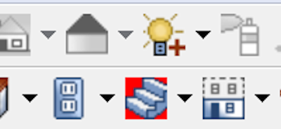
Here you go Mick. Here are a handful of icons I created
for X6 to replace ones I found to be less than intuitive.
1) Mouse-Orbit Camera - I overlaid the sphere icon with
CA's original mouse-orbit camera icon and added a
little color to the background to make it more visible.
2) Save - I replaced the hackneyed 3 1/2" floppy icon
with a simple "S".
3) Library Browser - I never could find those little books
on a shelf so I replaced them with highly visible letters.
4) Record Walkthrough - What a brown circle had to do
with recording walkthroughs I'll never know so I made
what for me is a more intuitive icon.
5) Project Browser - Ditto the Library Browser above.
6) Straight Stairs - Just added some color to Chief's
transparent background to make it easier to find.
I guess I really need to get on with upgrading to X7.
Compared to the 20 x 20 pixel format of X6, X7's 128
x 128 format will be like night and day. Heck with 128
x 128 I can make the Mona Lisa.


-
Rich how about a step by step guide to doing that. I would love too!
When done with them all Rich , please post to the Symbols Library
Thx.M.
JJ, I see that Mick has pretty much picked up
the ball and run with it but the process is easy.
Using the image editing software of your choice
navigate to the "buttons" (what Chief calls them)
folder. Most likely it will be:
C:\Program Files\Chief Architect\Chief Architect Premier\resources\buttons
and then open the Icon you want to change.
Creating icons is a mini art form in and of itself
(get it? mini art form
). Talk about a minimalistcanvas, X6 gives you 20 x 20 pixels to work with.
Although I haven't downloaded it yet I guess that
has been increased to 128 x 128 pixels for X7.
You can do anything you want from here. You can
copy and paste content or you can draw it from
scratch pixel by pixel. Once you have what you
want just save it to the "buttons" folder and the
next time you open chief you will see your revised
icon. Be advised it's probably a good idea to save
the original to another location so that you can go
back to the default icons if you wish to later. Also
be advised that there are lots of icons in the buttons
folder and it might take some searching to find the
one you want. If you aren't sure if you have the
correct icon you can edit it and then check to see
if the icon you wanted to change has in fact changed.
Remember that you will have to close Chief and then
restart it every time you change an icon for the changes
to take effect.
Here are a couple of other icons I have changed to
make them more recognizable (the Library Browser
and the Mouse Orbit Camera icons).
-
You guys do know that you can edit the icons to look
like whatever you want them to. They are just .PNG
files. You can edit them in Photoshop or PSP or even
in Paint.
Here I spiced up the background of the Stair Icon as an example.
-
I did this short video about the Joe Carrick phantom plant schedule turned into a plan note or key schedule. I love this thing.
Don't want to hijack your thread Mr. P but I just
wanted to say that of all the different video formats
people are using to post videos to the forum, your
Snagit videos display more clearly and at a suitable
screen resolution for me than all the others. I can
always see all the screen on my monitor without
making any adjustments and there are no annoying
progress bars or the like blocking pertinent information
from being viewed. I can clearly see what icons and
menu items you are referencing whereas with some
of the other formats I often need to pause the video
to be able to see what tools are being used.
This has been an unsolicited Snagit testimonial.
Now back to your regular programing.
-
...BTW...... I think the Padres might be pretty good this year..... I think we have 6 all stars on the roster...... World Series,,,, here we come!!!
Could be. This is the off year for the Giants.
-
Did you hear the conspiracy theory that the
'Hawks didn't give Lynch the ball because
the organization wanted anyone but Lynch
to be the hero?
-
Thanks for your answer Rich. To me still not doable in Chief without trouble. Any of those kinds of jobs coming my way, I'll take a pass.
Ditto.............
Doing the un-doable (or at least giving
it a shot) is what I'm all about.
Along with thinking the unthinkable.
I'm sure you guys have been down these
roads before so humor me as I beat my
head against some of these barriers.
Here is what I came up with by putting
openings into the wall before making it
a symbol. You've gotta look on the bright
side. If you don't open the door past 90°
it will shut automatically.


-
I believe the present ratio for a day (24 hour period?)
is 1 negative vote and 10 positive votes. Don't know
how the day vs. 24 hours is determined.
-
I have not really been around long enough to know
how it was in the "good old days" but it does seem to
me that the tone of the forum has changed recently
from one of problem specific solutions to one of
complaining (for lack of a better word) about the
perceived shortcomings of the software. As I have
said before the software is what it is and perspective
users would be better served by learning to use it in
it's current configuration than wishing it was more
like some other software program.
But don't despair. I have had a sneak peak into a
brand new one click interface Chief is working on.
Just click on the icon on the startup screen and the
software will read your mind and create a complete
set of detailed construction documents.

-
3
-
-
What are those symbols in your avatar?
They seem to be relics from the dark ages.
-
Hey guys, it was a late night and I burned a lot of brain cells
working on this one. Remember when Antoine stopped the
show and insisted that you try to tilt the origin logo out of
plumb? That's basically what I did with a wall. First I just
drew a straight section of exterior wall (I chose Stucco6
because I wasn't man enough to deal with the problems
presented by horizontal siding). Then while in 3D view I
converted the wall section to a symbol. I placed a copy of
the symbol into the plan view and using the Symbol
Specification dbx I rotated the wall section symbol 5° out
of vertical/plumb. Then once again while in 3d view I
created a new symbol out of the previous symbol. I now
have a symbol of a section of battered wall that is tilting
out 5° at the top. That was the easy part. Then I put a
copy of the tilted wall symbol into a fresh plan view and
tried to coerce it into behaving enough to get the results
you see. As you all have correctly surmised there are
some interesting issues to be dealt with not the least of
which is the fact that regular walls don't recognize and
interact with symbols of walls. I placed invisible walls on
top of the battered wall symbols to form a room but then
the floor and subfloor of the room wanted to extend out
beyond the bottom of the walls to be in line with the ceiling.
Rather than mess around with that I just removed the floor
and used a Polyline Solid for the floor. As Perry pointed
out putting openings into the wall symbols turns out to be
a bit more problematic. I was hoping somebody might
have a solution for that. The wall symbol won't accept
doors or windows and it doesn't show up at all in framing.
Plan B is to try putting the openings into the wall section
before turning it into a symbol and see how that responds
but I haven't had a chance to play around with that. This
was a banzai attack with no turning back to get these
results. When I regain my strength I will try to refine the
approach. Attached is an Interior vector view. All in all it's
pretty clean. Moldings are another thing that don't respond
to symbols of walls but I didn't want to take the time to do
them manually. I guess the $64,000 question is can a wall
symbol be made to act like an actual wall with all it's
attributes?

-
I can draw sloped/tilted walls. This is dedicated
to Antoine. He gave me the inspiration during the
symbols workshop.


-
1
-
-
What Bill said. That will get you back the missing
section of ridge cap. To get rid of the gap in the
gable fascia board you need to adjust the Fascia
top heights and Ridge top heights for the two taller
roof planes.


Some Projects ;-)
in General Q & A
Posted
Very nice indeed Kjell. Pray tell, how big
a file size does a video like that generate?
I have a 6 1/2 minute walkthrough of a 2
acre site that I created solely with Chief
software and that file is almost 400 MB.